SBR Financial Group Branding
Client: SBR Financial Group
Services: Logo, Stationery, Website Design, Info-graphics, Copywriting
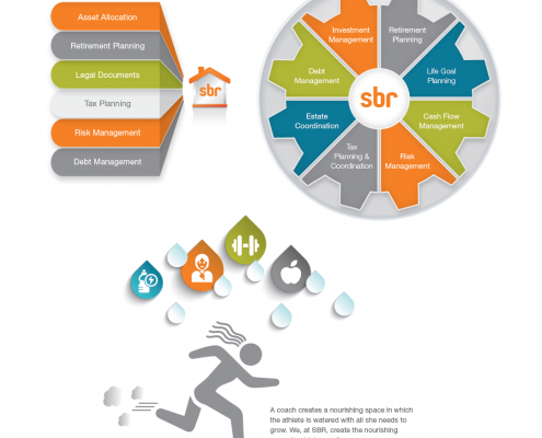
SBR Financial had a pretty unique philosophy behind their name and business. The partners, both triathlon fans, saw many similarities between the coaching process for a triathlon, and financial coaching. My task was to create a logo that conveyed the “swim, bike run” theme (SBR) and also make it fit this financial company. This was quite a unique challenge, and I was up for it! The final logo utilizes the shape of a coach’s whistle repeated 3 times. The logo’s movement in a positive direction signifies financial growth, as well as continuous work. Three “legs” signify the 3 aspects of a triathlon. It looks like running legs, swimming arms, or the spokes of a rolling wheel. The fun style also conveys the approachability of the the partners. They are definitely not suit-and-tie and did not want a traditional, stoic, financial logo design. They are much more out of the box and wanted their logo to portray that.
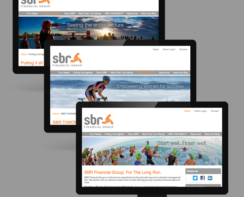
For the website design, I worked with Advisor Products who provide website capabilities specific to the financial industry. We chose a template and then customized the heart and soul of it!
What a pleasure to work with the talented Rich Cruse and his spectacular triathlon photography.


